If ads are the body, then the heart of your digital campaign is the landing page. Yet, many businesses fail to understand the purpose of having one or testing multiple variations of it. In most cases, they land paid traffic on the homepage, thinking that will do the trick and 99% of the time, they are wrong. Homepages are part of a larger website, their purpose is to inform people about your entire business, focused on showing as much as possible—that’s why visitors often fail to convert, while specific landing pages are optimized for conversions, they guide users through the funnel—towards making a buying decision.
Client & problem overview
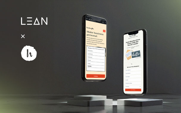
Meet Handwrytten—the leading handwritten notes service in the US that simplifies and automates the process of sending thousands of personalized cards to customers or employees, using custom-designed handwriting robots that hold real pens & ink.
Our main goal was to improve the CRO as fast as possible, so the test was to see if a more customized business landing page will perform better than their business site page (part of the whole website). So, we started asking “what’s missing?” & “what can we use from the existing one?”.

Results
The landing page experiment lasted about 10 days before we could draw conclusive results from the test. We reached a 92% boost in the CvR with 99% statistical confidence. We had 42% more sample requests, while the CPL dropped by 60%.
When we deep-dived into Google Analytics to understand better what has changed in the user behavior, we saw that neither the bounce rate or pages per session didn’t change drastically.
Hypothesis & ideas
Started with the basics:
- Use existing elements (creatives, structure, position & copy) that follow best practices
- Implement those onto your new landing page & think about where they will fit
- Follow the rules, but know when to break them
- Use learnings that you have from existing ads or competitors (positioning, voice, flow, creatives)
- Tailor the content to your user persona(s)—address their problems & explain how your product/service solves them, be aware of their motivations, fear factors, and make sure you use a clear CTA
Creative solution
Above the fold
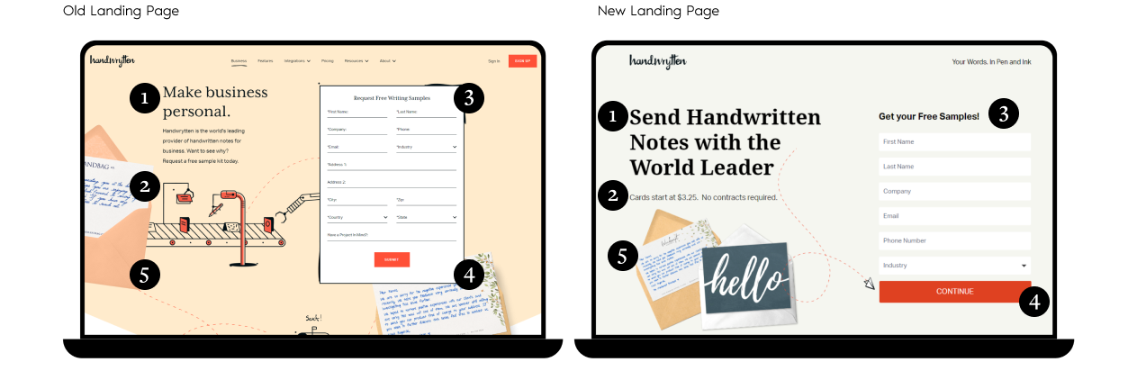
- Headline
- Changed the positioning to be more specific in explaining what the product is and why the potential customers should trust us
- Subheading and risk reducers
- Added pricing information to filter out users who are not prepared to pay the starting price, while reducing the risk of making a long-term obligation
- Sign-up form
- Removed unnecessary fields and changed to 2-step sign-up flow in order to showcase less questions so we don’t intimidate the users with the number of fields
- CTA
- We used “Continue” so they know right upfront what they can expect next—more questions. We personalized the last CTA that appears when they fill out the whole form and wrote it in first person
- Hero image
- Changed the illustration with product imagery to showcase more clearly what the product is and looks like
Below the fold

- 3-step process on how the product works
- Describe in 3 steps what the process of using the product looks like, but keep it brief
- Review scores and badges
- Present how a credible sources rated your solution
- USPs
- Communicate 3 value props like pricing options, key features (30 writing styles, 100+ designs), ease of use through automation & integrations
- Benefits
- Break down the benefits describing how the product helps them and why it’s different from other solutions
- In-app Integrations
- Give a visual overview of the main integrations options (logos of key players & platforms that businesses user
- Testimonials/Social proof
- Presenting why and how customers are satisfied with the service can help prospects make a positive decision
- Closing argument
- User-directed question with a clear CTA that communicates the end goal that the potential customers want to achieve